Are you looking to give your website a fresh, new look? If so, you may be wondering what website color schemes are and why they’re important. Keep reading to learn more about this topic so you can make the best decision for your website.
Color is one of the first things people notice when they visit a website. In fact, color can affect a person’s mood and emotions. That’s why it’s important to choose the right color scheme for your website. The wrong colors can make your website look unprofessional or even cause people to leave without reading your content.
There are endless color combinations you could choose for your website. But, not all color schemes are created equal. When choosing a color scheme, you need to consider the colors that will work well together and complement each other. You also need to think about the colors that represent your brand and what message you want to convey with your website.
Once you’ve chosen the perfect website color scheme, you’ll need to make sure it’s applied consistently throughout your website. This means using the same colors for your text, links, buttons, and other elements. A consistent color scheme will help create a cohesive look for your website that is professional and easy to navigate.
So, why are website color schemes important? They can affect a person’s mood, emotions, and first impressions of your website. The right color scheme can make your website look professional and cohesive. The wrong color scheme can cause people to leave without reading your content. With so much riding on the perfect color scheme, it’s important to choose wisely.
Read More: The 22 best website designs of 2022 for inspiration
Table of Contents
Frequently Ask Questions
What is the best color scheme for a website?
There is no one-size-fits-all answer to this question, as the best color scheme for a website depends on the specific goals and target audience of the site in question. However, some general tips that can be useful when choosing a color scheme for a website include considering the psychological effects of different colors, using a limited color palette to create a cohesive look, and making sure the color scheme is legible and easy to read. Ultimately, the best color scheme for a website is one that supports the overall goals of the site and creates a pleasing and user-friendly experience for visitors.
What color website attracts the most?
There’s no definitive answer to this question as it depends on the overall design and aesthetic of the website in question. However, some colors are more likely to grab attention than others. Bright, bold colors tend to be more eye-catching than muted or neutral shades, so if you’re looking to make your website stand out, consider using a bright color scheme. Additionally, colors that contrast sharply with one another tend to be more visually appealing than those that blend together, so a website with a high-contrast color palette may be more likely to attract attention than one with a more subtle color scheme.
Trendy website color schemes
Websites are using different colors to make themselves unique. There are colors that help a website stand out, and there are colors that make a website look more professional. In this article, we will explore the most popular color schemes for websites in 2022. These colors can help you create a trendy website that looks great and functions well.
1. The Authentic Brief

Whether you’re designing a new website or giving your existing one a facelift, it’s important to choose a color scheme that is both stylish and user-friendly. Pastel colors are becoming increasingly popular for their ability to create a sense of balance and harmony. Beige and blue are two colors that work well together, but you can also add a few brighter accent colors to help guide the eye around the design. Just be sure to avoid contrast issues by making sure your background and foreground colors have enough variation.
2. Bright Accent Color

If you want to make a certain part of your website stand out, you can use an accent color. This is a color that you use less of compared to the other colors in the color scheme. You can also use bright, bold, or neutral colors for this purpose. However, using a very bright color with a neutral color, like gray, will likely create a startling effect.
3. Website color scheme: Garish Neons and Bright purple
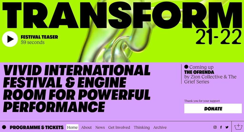
Neon colors are all the rage these days and for good reason. They can really make a website stand out and get noticed. This color scheme, with its bright lime green and purple, is a perfect example of that. The bold typography just adds to the overall impact. If you’re looking to make a statement with your website, then definitely consider going with a neon color scheme.
4. Website color scheme: yellow and brighter blues

Are you looking for a trendy website color scheme that will make your site stand out? Then consider using a golden hue with brighter blues. This color scheme is in-demand because it has a bright light feel that is easy to read and understand. (You can also invert this color scheme for a different, but equally interesting palette.) The blue color will help instill a sense of trust with the inviting tone of yellow. Using this color scheme for your website will give it a fresh and modern look that will attract visitors.
#FECD45 #2568FB5. Low Five Brewing

There’s no doubt that color has a big impact on our mood and emotions. And when it comes to website design, color is just as important in creating the right tone and atmosphere for your users. That’s why it’s important to carefully consider your color scheme when designing your website.
One great example of an effective use of color is Low Five Brewing’s website. They use a combination of different colors on their visuals and backgrounds to create a fun and unusual environment. In particular, they use very bright colors, which help create a unique experience.
One study found that saturated and bright colors are associated with arousal. So if you want to grab your users’ attention and communicate enthusiasm, consider using bright colors. But of course, you’ll want to use them sparingly and in the right context, or you risk overwhelming your users. Ultimately, the goal is to create a website that’s visually appealing and easy to use. So experiment with different color schemes and find what works best for you.
#73DFA1 #FFFF8B #E4BCFE6. Fabulatorij
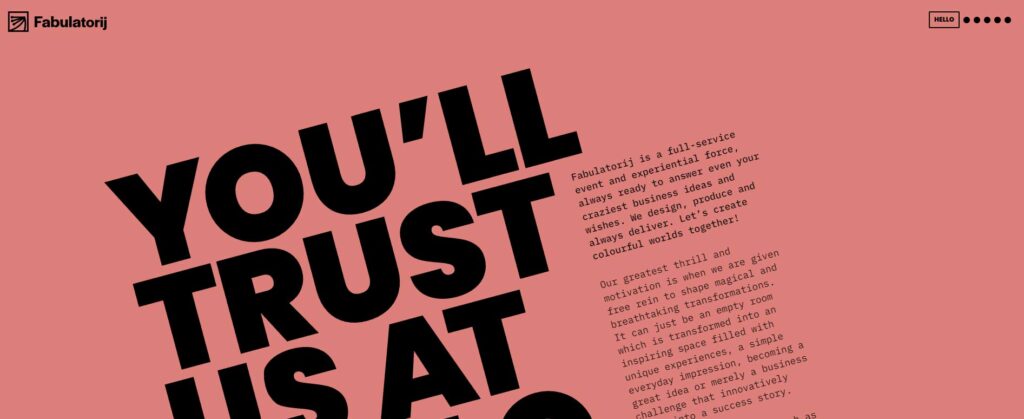
If you’re looking to add a touch of color to your website without overwhelming your users, consider a pastel color scheme. The Fabulatorij website uses a variety of colors to create a relaxing atmosphere. By combining warm and cool colors, they create a look that is both colorful and approachable. This is a great option if you want to add a bit of personality to your site without going overboard.
#DD7F7A #EBE8D6 #5C6CB2 #407F3E7. Website color scheme: black and gray-blue

In recent years, black and white color schemes have become increasingly popular in web design. Sigurd Lewerentz’s design is subtle and interesting. It marries black and white elements with a gray-blue that functions as both a background color and overlay for inactive screen elements. This modern color scheme blends a couple of recent color trends – black and white palettes and muted or pastel hues. Consequently, the effect is both stylish and serene.
#A0AECD #0000008. Website Color Scheme: Gray and Lime Green

One of the most popular color schemes for websites is black and white with a lime green accent. This color scheme is perfect for those who want a modern look for their website. The deep gray background with bright green accents makes this color scheme stand out from the rest. If you are looking for a new twist on the yellow and gray color scheme, this is the perfect option for you.
#6E6E6E #BCFD4C9. Website Color Scheme: Pastel pink and dark blue

If you’re looking for some inspiration for your next website design, why not take a cue from Libenar? Their use of pastel colors is spot-on for two reasons. First, pastels convey a sense of softness and innocence – perfect for advertising products aimed at children. Second, the combination of pink and blue makes any call-to-action buttons and the menu bar easily visible to the user. So if you’re stuck on what colors to use for your next project, consider following Libenar’s lead!
#F5B8BC #084D9210. Omega Yeast
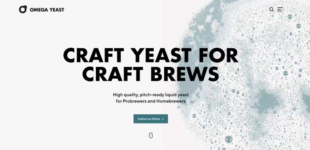
Websites are increasingly using images as the basis for their color schemes. This is because pictures can tell a story more effectively than colors alone. Omega Yeast is a good example of this trend. The website’s design uses black and white as its base, but the main image is what gives it its color. This approach is becoming more popular as it allows designers to create a more effective branding experience.
#F7F7F7 #7DA2A911. Apple
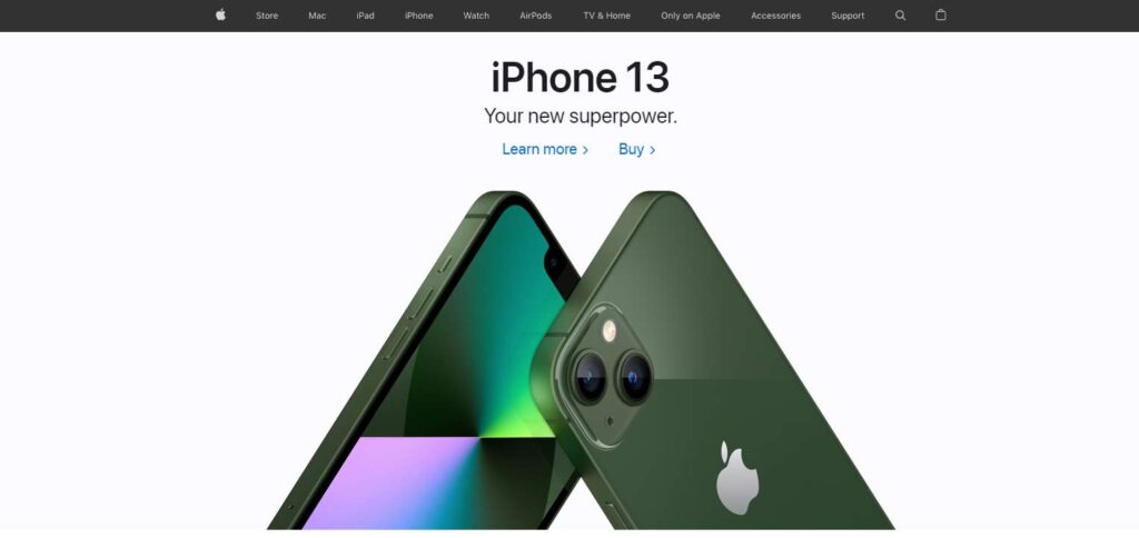
If you’re looking for some inspiration for your website’s color scheme, why not take a cue from Apple? They use a neutral black or white background to make important elements like CTAs really stand out. And their electric blue accent color is both eye-catching and serious-looking – perfect for getting potential customers’ attention.
Of course, you don’t have to use blue as your accent color. But whatever color you choose, consider making white your background. It’s an excellent choice for creating contrast and making other elements pop.
#000000 #FBFBFD #FAFAFA #2B8AD712. Swissdent Creative Nights

Swissdent is a dental product brand that takes a minimal approach to colors by using one single color, along with its variations, on each of the website’s pages. This makes for a sleek and premium look that is perfect for a high-end brand. If you are looking to create a similar aesthetic for your own website, consider using a similar color scheme.
#F9F9F9 #95060F #1F563E #BEC1C213. Darker Slumber

Pantone’s color of the year, Classic Blue, is used prominently in Slumber’s app imagery and dark tones in the background and logo. The pairing with gold and green is very trendy and elegant, following along with the night and sleep Theme. This color scheme is sure to be a hit this year!
#051622 #1BA098 #DEB99214. Website Color Scheme: Head Space

If you’re looking for some inspiration for your next website color scheme, why not take a cue from Headspace? Their use of stark colors against white space is both eye-catching and orderly, perfect for any type of app or website. Not to mention, it’s a great way to highlight important content. So if you’re looking for a scheme that’s both colorful and peaceful, Headspace is a great example to follow.
#FFFFFF #FFCE00 #FEB700 #0994F4 #FF7E1E15. Website Color Scheme Rock Paper Plant

Looking for a fun, youthful website color scheme? Look no further than Rock Paper Plant! Their use of pastel shades of pink, purple, blue, and orange create an environment of joy and energy. Plus, orange is perfect for all brands that want to be associated with youthfulness and fun. So if you’re looking for a fresh, trendy website color scheme, Rock Paper Plant is the way to go!
#9D28B5 #005CBA #FF6A00 #F6A2BC16. Website Color Scheme: PlayBook
There are a few different ways you can go about choosing the right colors for your website. You can either use a flat color scheme like the Playbook website, or you can opt for something a little more vibrant. If you want to keep your website clean and simple, a flat color scheme is the way to go. You can use muted, calm colors like white, and then use a pop of color like red to shift the attention to your call-to-action (CTAs). This will invite users to take action and get early access to your product. Another option is to choose a more vibrant color scheme that will make your website stand out. Whichever route you choose, make sure you put some thought into your color selection so that you can create a website that is both visually appealing and effective.
#FFFFFF #FF2853 #F5EBE617. Website Color Scheme: Atlanta Brewing

Red is a powerful color that can evoke many emotions. It’s no wonder that so many businesses use it as part of their branding. Atlanta Brewing is one such company that uses red prominently on their website and in their product packaging. They have a wide palette of colors, with primary colors as the base and a rich black and white background. Using red as part of your branding can help create a strong emotional response in your customers.
#E40C2B #1D1D2C #F7F4E9 #3CBCC3 #EBA63F #43894518. Website Color Scheme: Sunny Street Cafe
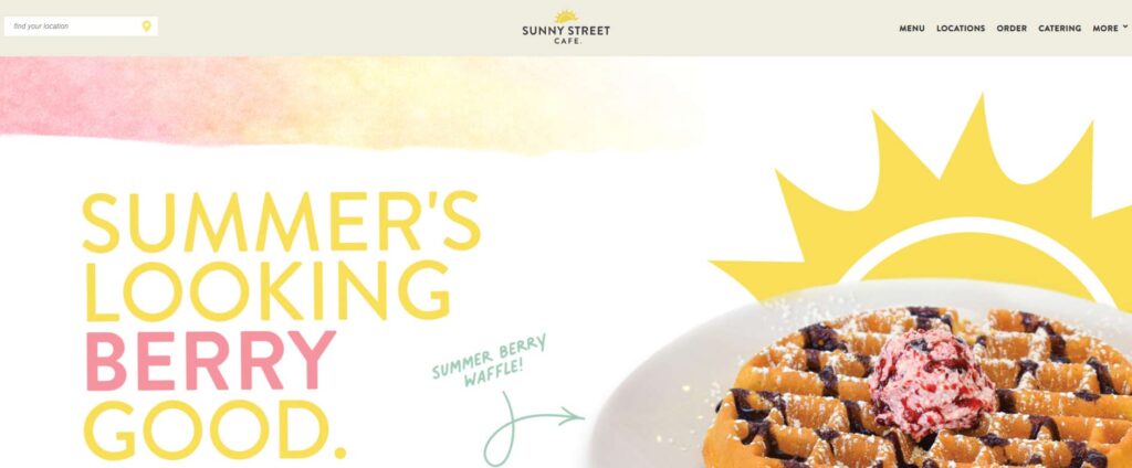
When it comes to website design, one of the most important aspects to consider is the color scheme. The colors you choose can set the tone for your entire site and play a big role in how your visitors perceive your brand. That’s why it’s important to carefully select a color palette that reflects the personality of your business.
If you’re looking for some inspiration, take a cue from Sunny Street Café. This restaurant’s website features a bright and cheerful color scheme that perfectly matches the images and language used throughout the design. The use of greens and yellows together is an unusual combination, but it feels friendly and just right for this breakfast and lunch spot. The color theme also brings out the food imagery nicely.
When it comes to your own website, take some time to consider what colors will best represent your business. And if you need a little help, don’t be afraid to reach out to a professional web designer for assistance.
#5C6E58 #8AA899 #F2D34919. Website Color Scheme: Mint Intuit
trustworthiness and confidence. Different shades of blue are used to give a sense of security to the user. Blue is also associated with being dependable and sincere. Health care and financial service websites commonly use blue in their color schemes.
Choosing the right colors for your website can be a tough decision. There are so many factors to consider, and you want to make sure that your final choice reflects the image and message you’re trying to convey. If you’re stuck, why not take some inspiration from popular websites in your industry?
#EEFFFD #03CDAA #0B978920. Website Color Scheme: Pittori di Cinema

If you’re looking for a trendy website color scheme, why not try a high-color minimalism option? Pittori di Cinema shows that minimalism can be full of color. A bright yellow scheme with black is a popular choice. The brighter the colors, the more on-trend your website will be.
#FDD935 #00000021. Website Color Scheme: Animus Studios
The Animus Studio agency website uses different colors on each page to make the website eye-catching and interesting. As their “about us” page says, they are able to keep it professional while still maintaining a fun and inviting atmosphere. The use of bright and bold colors throughout the website is a great example of how you can take inspiration from creative industries. By using a variety of colors, they are able to keep the website fun and exciting while still providing users with the information they need.
#000000 #5F65F2 #5E62FB #FFDD4F #EB7270 #13799C #FC6A6C22. Website Color Scheme: UX Kathart

If you’re looking for a trendy website color scheme, look no further than UX Kathart. They use a simple color palette with a pale blue background and shades of pinkish red for the main art element. This combination is modern and fun to look at. Plus, it’s sure to make your website stand out from the crowd.
#E1F2F7 #EF0D50 #EB3A70 #E5BACERead More: The 22 best website designs of 2022 for inspiration
Final Thoughts
What’s your favorite color scheme? Do you have a particular set of colors that you love to use on your website or blog? If you’re like most people, you probably don’t give much thought to the colors you use on your site. But believe it or not, the colors you choose can have a big impact on how visitors perceive your site.
A recent study showed that people make judgments about a website’s credibility based on its color scheme. So if you’re looking to make a good impression, it’s important to choose a color scheme that conveys trustworthiness and professionalism.
The good news is that there are a few tried-and-true color schemes that tend to work well for most websites. If you’re not sure where to start, contact us.
Once you’ve chosen a color scheme, take some time to experiment with different color combinations. You may be surprised at how much of a difference the right colors can make. You can also hire a designer to create a beautiful website with your desired Website Color Scheme.

