
Bad website design is all too common on the internet. It seems like every day there’s a new, flashy website that’s trying to grab your attention. But more often than not, these websites are downright terrible. They’re cluttered, confusing, and frustrating to use.
So what makes a bad website design? There are a few key things to keep an eye out for. First of all, bad websites are usually overloaded with information. They try to pack in too much text, too many images, and too many links. This makes it incredibly difficult to navigate and find the information you’re looking for.
Another key element of bad website design is poor usability. A website might look great, but if it’s not easy to use, people will quickly get frustrated and give up.
If you’re looking for a new website, take the time to do your research. There are plenty of great website design companies out there that can create a beautiful, user-friendly website for you. But there are also a lot of bad ones. Avoid the headache and heartache by doing your homework before you choose a web design company. It may save you a lot of time and money in the long run.
Table of Contents
Frequently Ask Questions
What is a bad website?
There are a few things that can make a website terrible, such as a lack of purpose, boring content, bad design, and technical problems. A website without a purpose is like a ship lost at sea- it may have all the right parts, but it’s going nowhere. Boring content is often due to a lack of personality or passion from the website’s creator. If you’re not interested in what you’re writing, your visitors won’t be either. Bad design can be incredibly off-putting, and often makes a website look unprofessional. Technical problems can include anything from broken links to pages that take forever to load. Ultimately, a bad website is one that doesn’t serve its purpose and fails to engage its audience. If your website is falling short in any of these areas, it’s time to make some changes.
How do you know when a website is bad?
When you’re looking for information online, you want to be sure that you’re getting reliable, accurate results. But how can you tell if a website is reputable? Here are a few things to look for:
– The site should have a professional appearance. If it’s full of typos and errors, or if it looks like it was put together in a hurry, it’s probably not a reliable source.
– The site should have a clear purpose. If you can’t figure out why it exists, or what kind of information it’s trying to provide, be wary.
– The site should be up-to-date. If the last update was years ago, the information is probably out of date.
– The site should have credible sources. If you can’t find any information about who wrote the content or where it came from, be skeptical.
If you’re unsure about a website, take some time to do some additional research. See if other reputable sites are linking to it, or search for reviews. With a little effort, you can be sure you’re getting the best results from your online searches.
What makes a good website?
What makes a good website? This is a question that has been asked since the early days of the internet. There are many factors that contribute to a good website, but some of the most important include:
-Aesthetics: A good website should have a pleasing design that is easy on the eyes. It should be organized in a way that is easy to navigate, and it should make use of whitespace to avoid feeling cluttered.
-Functionality: A good website should be easy to use and should work the way users expect it to. All of the links on the site should work, and the site should load quickly.
-Content: A good website should have high-quality, unique content that is relevant to the site’s audience. The content should be well-written and free of grammatical errors.
-SEO: A good website should be optimized for search engines so that it can be easily found by users who are searching for information related to the site’s topic.
-Speed optimized: A good website should load quickly, even on slower internet connections. This is achieved by compressing images, using caching, and minifying CSS and JavaScript files.
-Security: A good website should be secure, with an SSL certificate installed to protect user data.
These are just a few of the many factors that contribute to a good website. By keeping these things in mind, you can create a site that users will enjoy visiting and that will be successful.
20 Bad Websites Designs
Websites are like first impressions; you only have one chance to make a good one. But what happens when your website is so bad that it becomes memorable for all the wrong reasons? In this blog post, we’ll take a look at 20 of the worst website designs on the internet. From outdated design elements to confusing navigation, these websites will make you wonder how they ever made it online.
So, whether you’re in need of a good laugh or some serious design inspiration, take a look at these 20 websites that definitely missed the mark.
1. The Big Ugly Website

There are some truly terrible website designs out there. The Big Ugly Website is a perfect example of this. It’s full of outdated design elements, lame animations, and ugly fonts. There is no navigation to speak of, making it very difficult to actually use the site. In short, it’s a total mess. Thankfully, there are plenty of other websites out there that don’t suffer from these same problems. So if you’re looking for a well-designed website, be sure to avoid the Big Ugly Website.
2. Craigslist

There are some websites that have really bad designs but are still popular among users. One example is Craigslist. The website consists solely of links and has not changed much since 1995. Even though the design is not great, it is still used by many people. The link-based structure is actually the key to its success.
3. Irish Wrecks Online

There are a lot of bad website designs out there. One example is Irish Wrecks. This website provides guidelines about wreck shipping to the Ireland shipping industries, but it’s very basic and has broken links. There’s no About Us page or other information about the company, which leaves users searching for more details. Overall, this website is not a good user experience and would likely turn people away.
4. Gates and Fences

If you’re in the market for a new fence or gate, you might want to think twice before hiring Gates and Fences. This website is crammed full of content, making it difficult to navigate, and the contact information is displayed right at the top, hiding the name of the company. With so many other options out there, you can definitely do better than Gates and Fences.
5. Blinkee
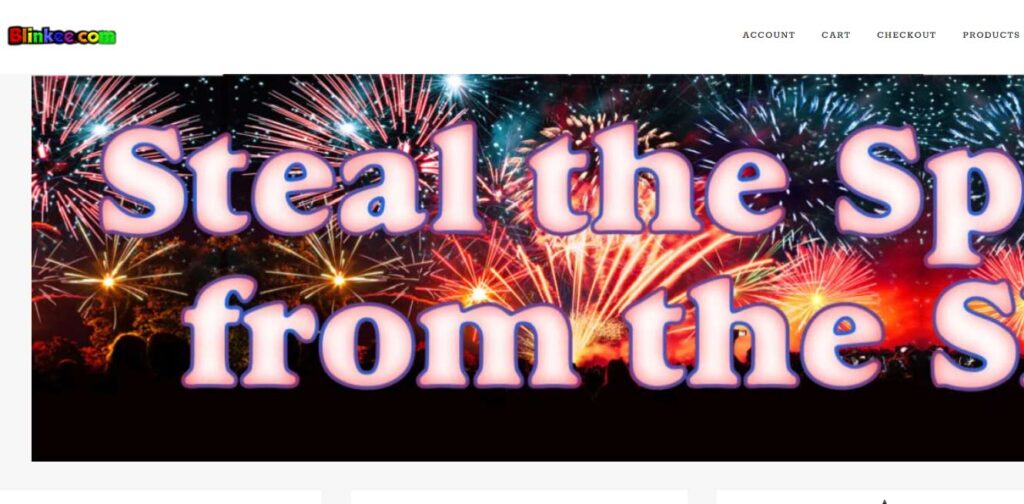
Blinkee is another example of a bad website design. There’s a lot more to effective design than just aesthetics. In fact, bad website design can actually discourage users from engaging with your site.
One example of ineffective website design is the use of confusing fonts, poorly chosen color schemes, and too many animated images. Everything moving around on the page can be incredibly distracting and even frustrating for users. Another problem is the lack of segmentation of products on the main page. This makes it difficult for users to find what they’re looking for, leading them to give up and go elsewhere. Additionally, missing features like functional buttons and New Arrivals, Top Sales, and Promo Offers blocks can make it difficult for users to take action on this site.
If you want people to actually use your website, it’s important to design it in a way that is user-friendly and easy to navigate. Otherwise, you’ll just end up driving people away.
6. Berkshire Hathaway Inc
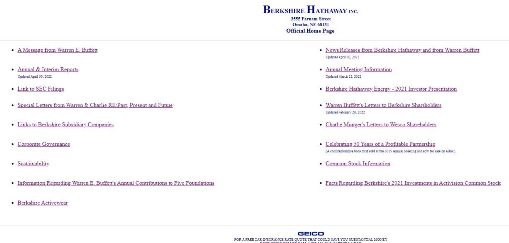
There are plenty of examples of bad website design out there on the internet. One prime example is Berkshire Hathaway Inc. While its website is clean and light, it doesn’t reflect what a multinational holding company should be. Their website is just way too far from what it should be.
Bad website design is often the result of a company not knowing what its target audience is. A good web designer will be able to help you create a site that reflects your company’s values and helps you reach your target market. However, some companies make the mistake of thinking that a flashy, complicated website will impress potential customers. In reality, this can often be off-putting and result in lost business. If you’re not sure how to design a website that will work for your company, it’s best to consult with a professional.
7. The World’s Worst Websitе
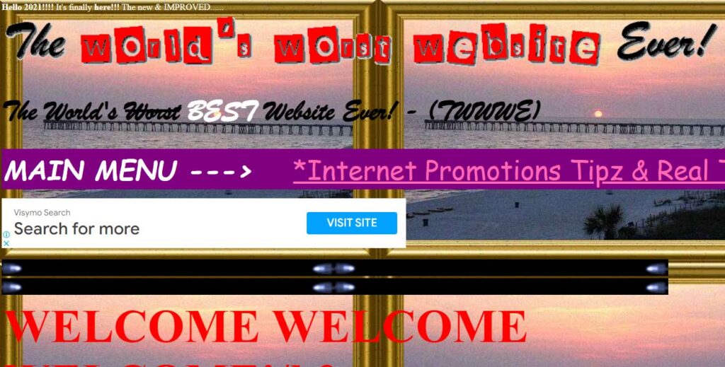
Bad website design is something that plagues the internet. There’s no shortage of bad design out there, and it seems like new examples pop up every day. Thankfully, there are also people working to call attention to these design mistakes and help webmasters avoid making them.
One such project is The World’s Worst Website. This site collects all the worst design elements in one place, exaggerating them for effect. Everything from conflicting colors and incompatible fonts to unformatted and unstructured content and underlined links are on display. And that’s just the tip of the iceberg!
Navigating this website is an exercise in frustration, but it’s still worth checking out if only to see what NOT to do with your own website. So if you’re looking for some design inspiration or just a good laugh, be sure to check out The World’s Worst Website.
8. Lingscars

Lingscars is a perfect example of bad website. The website is hard to navigate and it is unclear what the purpose of the website is. The colors, textures, animations, and fonts are all mismatched and create a feeling of chaos. There are too many banners, videos, and links on the page, making it difficult for users to find what they are looking for. The layout of the website is illogical and makes it hard to use. For example, the icons for social media are in the middle of the page, there is a lot of empty space between the content and the footer, and the header is overloaded with text and graphics. If you are looking for a well-designed website, Lingscars is not the place to find it.
9. Interrupt Tech Corp.

There are plenty of bad website designs out there, but Interrupt Tech Corp might just take the cake. There’s nothing particularly wrong with the domain name, but the overall design feels like it was thrown together without any real thought or purpose. Even the company’s explanation for why the site looks the way it does is hilariously self-defeating. In short, it’s a prime example of how not to do web design.
10. Yale School of Art

If you’re looking for a creative and convenient website, you’ll be disappointed with the Yale School of Art. The site is poorly designed, with a lack of structure and poor header, footer, and sidebar design. There are also blinking animations, underlined links, strange pictures, and low-quality photos. While some might find the site’s artistic approach original, its usability is far from perfect.
11. Serene-Naturist
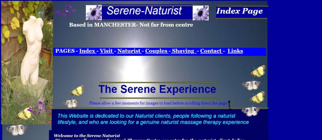
It’s hard to imagine how any of the design elements on this website are related to a spa center. The blue text on the blue background, flying butterflies, and antique bust make it very difficult to navigate and understand what the site is trying to promote. Google remains a great example of minimalism and ease of use, despite not having any of these design elements. When it comes to website design, less is definitely more.
12. Paradise Drinking Water
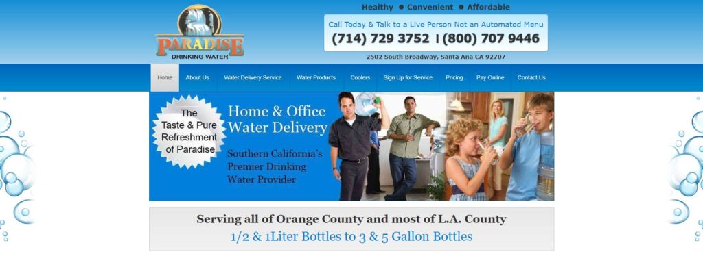
Bad website design can be really off-putting for users. If a website looks outdated or inconvenient, people are likely to click away and look for another option. This can be a big problem for businesses, which may lose out on potential customers and sales. Poorly designed websites can also be overloaded with information, lack clear structure, and have low-quality images. This can all make it hard for users to navigate the site and find what they’re looking for. Order buttons may also be missing, making it more difficult for people to purchase products or services. To avoid losing business, it’s important to have a well-designed website that is easy to use and navigate.
13. Toronto Cupcake

If you’re in the market for cupcakes, you might expect to see a website that’s full of delicious-looking images and bright, enticing colors. Unfortunately, the owners of Toronto Cupcake seem to have neglected this opportunity to attract new customers. The main page is quite plain and simple, with no useful information about the company. The text in the footer is quite small and difficult to read, and there’s a huge blank space at the bottom of the page. Navigation is also quite difficult. In short, if Toronto Cupcake wants to make its website more effective, it’ll need to improve its design and usability.
14. Vortex Technology

There are some truly terrible website designs out there. If you’ve been around since the early days of the internet, you’ll remember the days of dial-up networking. then Vortex Technology is for you. you will find so many scattered links and text there. It’s terrible design, and it’s a perfect example of what not to do when creating a website.
15. University of Advancing Technology

Bad usability can be a real pain for users, and the University of Advancing Technology is a perfect example of this. With main page loading times that exceed 40 seconds, it’s clear that there are some serious technical issues at play. These animation-heavy, high-resolution pages may look pretty, but they don’t offer the necessary information that users are looking for. The navigation menu is probably the only good thing about this website. Otherwise, it’s a real mess.
16. Bob Saget

The information is all there, but the structure of the site is messy, with unclear headings between sections, lots of off-grid elements that try to distract you, and texts with a lack of contrast. All of this makes it difficult for users to actually find and use the information they need.
It’s important to keep your website design clean and organized so that users can easily find what they’re looking for. Otherwise, you run a significant risk of losing them. If you’re not sure how to do this, there are plenty of resources out there that can help you get started. And if you need some inspiration, take a look at some of the best-designed websites out there. They’ll show you just how effective a well-designed website can be.
17. Agents of America

There are plenty of bad website designs out there. And, unless you have previous experience with the agents, one can hardly tell what agency this website discusses. It’s also not clear what they offer. The site looks more like a blog with an unclear niche. So, be wary when choosing an agency for your own website design needs. Do your research and make sure you select a reputable company.
18. CashNetUSA

The colors on the website are nice, but the lack of images makes the company look bad. The hero area is especially bland and uninteresting. This makes it hard to take the company seriously.
19. Meity

This is another example of a bad website. They’re too colorful, have too much information, and are just overall gaudy. The live update animation hampers the usability and user experience, making visitors divert to other platforms for the same information. If this is optimized well, the website can be quite informative and work wonders for visitors.
20. Meity

It’s no secret that there are a lot of bad websites out there. But what makes a bad website design? In our opinion, it’s a combination of things including bad color choices, dated or inappropriate typography, and a general lack of cohesion. One prime example of a bad website design is BH cosmetics. This one-page beauty website is rife with problems, from its eye-hurting flash animation to its uneven font sizes and lack of overall coherence. If you’re looking for a well-designed website, BH cosmetics is definitely not the place to go.
Final Thoughts
Bad website design is all around us. It’s everywhere we look, and it’s getting harder and harder to avoid. But why? Why are there so many bad designs out there?
The answer is simple: because people don’t care. They don’t care about their users, they don’t care about good design, and they don’t care about the internet. They just want to make a quick buck, and they don’t care how they do it.
This is why it’s so important to be careful when choosing a website design company. You need to find a company that cares about its users and wants to create a good experience for them. Otherwise, you’re just going to end up with another bad design.
So, how can you find a good website design company? The best way is to ask around. Talk to your friends, family, and colleagues and see who they would recommend. Once you’ve found a few companies that look promising, take a look at their portfolios and see if their work is up to your standards.
If you’re still not sure, then it’s time to take the plunge and hire someone to design your website. Just make sure that you find a company that you can trust, and that you’re comfortable working with. Otherwise, you might just end up with another bad website design.
Photo Credit by Unsplash by christopher lemercier
