As more and more web designers are beginning to see, black websites can be just as clean, modern, and elegant as their white counterparts. The key is simply to use the right amount of black so that it doesn’t overwhelm the viewer. When done properly, black websites convey a feeling of wealth and sophistication.
If you’re looking for some inspiration for your own black website designs, be sure to check out the list below. These designers have done an amazing job of creating beautiful and unique black websites that are sure to stand out from the crowd. Use them as a starting point for your own designs, and don’t be afraid to get creative!
Read More: Why you need a professional web design company
Frequently Ask Questions
What does a black website mean?
A black website is one that has been designed to look and feel like a traditional website, but with a black color scheme. Black websites are often associated with sophistication, mystery, and power. They can convey a sense of seriousness or authority and are often used for corporate or government sites. Black websites can also be used to create asense of exclusivity or luxury, and are often seen as more stylish than their white counterparts. Whatever the reason for choosing a black website design, it’s important to make sure that the overall look and feel of the site are in keeping with the desired tone and message. A well-designed black website can be an impressive and effective way to communicate your message to the world.
Is black a good website background?
Most people believe that black is not a good color to use for website backgrounds. Black can be depressing, making it difficult for visitors to stay on the site for long periods of time. In addition, black can make text difficult to read, which can cause potential customers to click away from your site before they even have a chance to see what you have to offer. However, there are some advantages to using black as your website background color. Black can be sleek and professional-looking, which can give your site a high-end feel. In addition, black is a versatile color that can be used in conjunction with other colors to create an eye-catching design. If you decide to use black as your website background color, be sure to use it in moderation and pair it with lighter colors to avoid overwhelming your visitors.
When does it make sense to create black websites?
It’s not always easy to know when it’s appropriate to create a black website. After all, there are a lot of different factors that come into play when making this decision. However, there are a few general guidelines you can follow to help you make the best decision for your business.
First and foremost, it’s important to consider your target audience. If you’re targeting a demographic that is more likely to respond positively to a black website, then it makes sense to create one. On the other hand, if your target audience is less likely to be receptive to this type of website, then you might want to reconsider.
Another important factor to consider is your business goals. If you’re looking to create a website that is designed to generate leads or sales, then a black website can be an effective tool. However, if your goal is simply to provide information or build brand awareness, then a more traditional website might be a better option.
Ultimately, the decision of whether or not to create a black website comes down to a number of factors. By taking the time to consider your target audience and your business goals, you’ll be able to make the best decision for your needs.
30 most stylish black website examples of 2022
black websites have been increasing in popularity over the past few years. This is likely due to the increase in black-owned businesses and the need for black customers to have a place to find them. There are many black websites that cater to different interests and needs. Here are 30 of the most stylish black web page of 2022:

If you’re looking for a timeless web design with sleek layouts and photos, DMS technology is the way to go. You’ll love the clean look of the black, blue, and white color scheme. And, thanks to the black background, blue and white really pop. Plus, the mobile-friendly interface makes it easy to view on any device. Crisp and clear visual media completes the package.
Piston Nerd is a great website for anyone interested in cars or 3D animation. The website has a sleek, black design with smooth, top-notch animations. One of the best features of this website is the vintage-style gallery. This website is a great example of how a black background can really work well with a website’s concept. The clean and innovative web design is also impressive. Another great feature of this website is the ‘specifications’ table, which provides detailed information about the car. Overall, Piston Nerd is a great example of a well-designed website.

Tagheuer is a French website promoting Watches. If you’re looking for some inspiration for how to use darker colors on your website, take a look at the Tagheuer site. It’s not a solid black, but it uses a range of dark colors from black to white. This creates a beautiful look for a watch company, with a colorful look with black color.
There are many advantages to having a black website. One is that it can give a premium feel to certain products. For example, Jack Daniels benefits greatly from a dark design. The right balance of font choice, color, empty space, and well-designed visuals can make all the difference for a brand like this.
Pasticceria Adami’s website is a great example of how to effectively use a dark background. By using minimal images, fonts, and page elements, the site creates a simple but striking design. This shows that black websites can be both beautiful and functional. If you’re looking for inspiration for your own site, definitely check out Pasticceria Adami’s!
As someone who loves both graphic design and storytelling, I was immediately drawn to this website. The simple but stunning design, with a ripple effect overlaying the Korean text, immediately caught my attention. And the more I explored the site, the more I became impressed by the creative and interactive graphics, smooth animations, and well-crafted transitions. This site is a great example of how powerful a well-designed website can be.

When you visit the Black Rainbow website, you’re in for a truly unique and immersive experience. Not only are the 3D animations stunning, but the audio is superb as well. This website is an incredible example of great design, flow, and storytelling. You won’t soon forget it!

As you scroll down the homepage of this black website, you’ll notice that it tells a great story of the company. The site includes background videos, photographs, and transitions that all come together to create a creative and well-designed whole. Even though not every single section is black, the dark and light areas flow well together. This makes for a space and avionics company that is definitely worth checking out!
When it comes to design, 1MD knows how to keep it clean and simple. Their dark website design is minimal and easy to understand, with each section having a specific purpose. The use of color highlights, animations, and transitions add personality and interest to the website, while still maintaining a clean and simple look. The same can be said for their portfolio work pages – they are well-designed and easy to follow, with a strong focus on the use of visuals. 1MD’s overall website design is excellent and worth checking out for some inspiration!
If you’re looking for an incredible web design, look no further than TRWM. This site is packed with great videos, amazing graphics, and powerful typography. Plus, the smooth scrolling and high-contrast black and white background make it stand out from the rest. You can learn a lot from this site’s design, including how to create a great user experience, how to use smooth pop-up visuals, and how to make call-to-action buttons that are impossible to resist.
What makes LONGSHOT’s website design so great? For starters, the company is founded by artists, making their projects both big and small more creative and interesting. Additionally, the website boasts eccentric and witty animations that are reminiscent of classic pop culture illustrations. Lastly, all of the content on the site is original and Concept-driven. If you’re looking for a website that’s visually stimulating and totally unique, LONGSHOT is definitely worth checking out.

If you’re looking for a sleek and elegant black web page design, then you’ll love Apple’s latest creation. The new Apple Watch series is set against a stunning black background, which really makes the product photos pop. Plus, the black background of the watch’s screen ensures that all the details are easily visible.
The overall effect is one of sophistication and exclusivity, which is sure to appeal to anyone who sees it. So if you’re looking for something a little different, be sure to check out Apple’s latest black website design. You won’t be disappointed!

If you’re looking for a well-designed black web page, look no further than dropbase.io. The site sticks to a clean style guide, with large white san-serif typography, a well-established grid, and small use of accent colors throughout. Whether you’re on the blog, the pricing page, or the homepage, you’ll see the same consistent design. Plus, the Dropbase team knows how to present their product in a way that is both informative and visually appealing.

When it comes to website design, Pusher takes things to the next level. With its unique user experience and sleek web design, Pusher is a site that is sure to leave a lasting impression. The cube-shaped images used on the site are also memorable, making Pusher a great choice for anyone looking for a true one-of-a-kind website.

When it comes to web design, Vovi Studio is definitely a name to reckon with. The studio’s tagline is sleek and attention-grabbing, and the overall color scheme is simply gorgeous. But the real magic happens when you hover your mouse over the shapes on the page. A color-pop effect will greet you, making the whole experience even more delightful.
This website is a great example of how plain and gradient color schemes can work so well together. If you’re looking for some inspiration for your own web design projects, definitely check out this site.
If you’re looking for a beautifully designed website that will really stand out, then you need to check out Aristide. They’ve done an amazing job with their portfolio presentation, and it’s clear that they put a lot of thought into every aspect of the design. From the organization and theme to the originality and color palette, everything about this website is top-notch.
What’s more, Aristide provides a great user experience, with seamless navigation and plenty of eye-catching visuals. So if you’re looking for some inspiration for your own website design, then this is definitely a site you should check out.
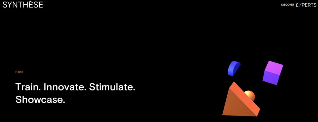
When it comes to black websites, Pole Synthese is definitely one that stands out. The combination of white and black backgrounds works really well, and the use of black as an accent color is also very effective. It’s clear that a lot of thought went into the design of this website, and it’s definitely worth checking out if you’re looking for some inspiration.
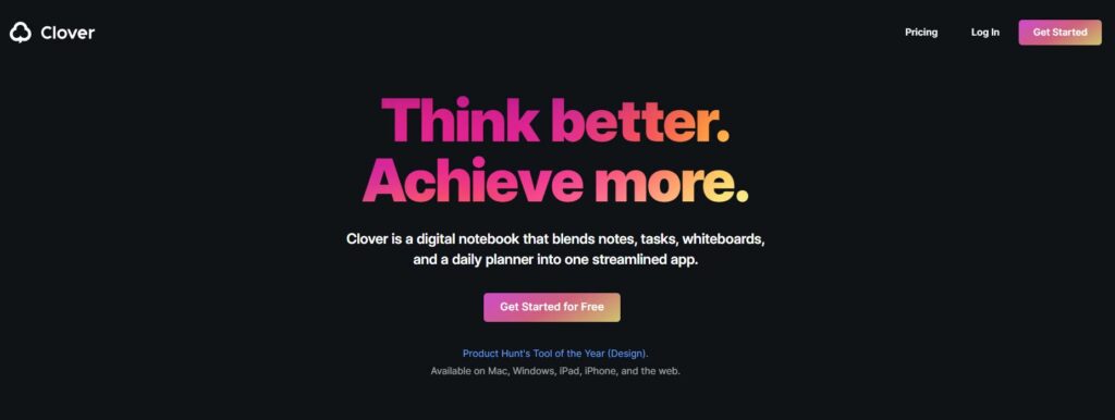
As you browse through Clover’s website, you’ll notice how light and airy the dark design actually feels. It’s not crowded or overwhelming – it’s a perfect example of a stylish black website. The different shades of dark gray work well with one another, and the transitions and animation add a modern and slightly vibrant touch. At the same time, the white and purple color accents draw your eye towards different details of each section as you scroll.
What do you think of when you see a black website? If you’re like most people, you probably think that it looks too dark or moody. However, Clover’s website is a perfect example of how a black website can actually be light and airy. The different shades of dark gray work well together, and the transitions and animation add a modern touch. Plus, the white and purple color accents help to draw your eye toward different details in each section. So if you’re ever considering a
If you’re looking for an amazing browsing experience, Totem is the website for you. Scrolling through the site is like playing a game, with magnificent animations and a truly unique font style. You can learn a lot from this great website design, including how to create whimsical animations and captivating fonts. So take a look and see what you can learn!

If you’re looking for some amazing black web page, look no further than Demilie. This website is chock-full of creative and playful designs that are sure to wow. From animations and motion graphics to vibrant colors, Demilie has it all. And the best part? The fun doesn’t stop at the homepage. Keep scrolling to see even more of this website’s brilliance.

There’s no doubt that first impressions matter, and when it comes to websites, that couldn’t be more true. Upon visiting Pluto App’s website, you’re immediately met with a sleek, futuristic design that is unlike anything else out there. From the color-changing effects to the 2D to 3D transitions and scrolling animations, every element on the site is eye-catching and interactive. It’s clear that a lot of thought and care went into the design of this website, and it really pays off.
Not only is Pluto App’s website visually appealing, but it’s also highly user-friendly. The innovative UI makes it easy to navigate and use, even for those who may not be tech-savvy.

When you first land on the Haptic website, you’re immediately struck by the minimalist design. The black background, combined with the white typography and photos, creates a stark contrast that is both eye-catching and pleasing to look at. But it’s not just the aesthetics that make this website great; the use of whitespace makes it easy to navigate and scroll through, which is a major plus in our book.
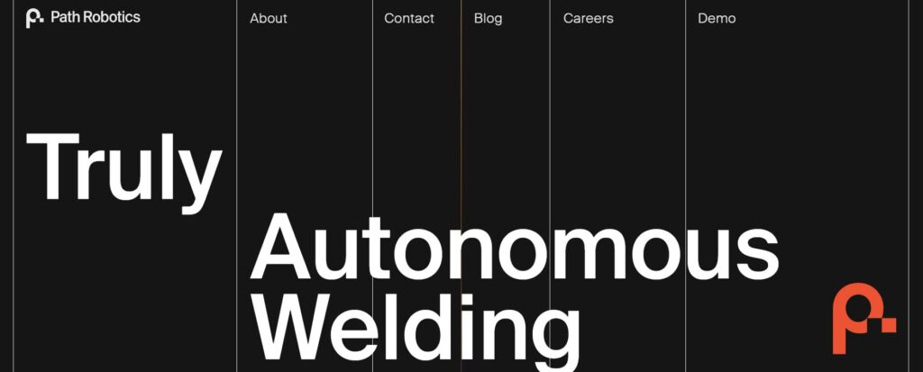
On Path Robotics’ website, you’ll find an innovative design with a black background, white font, and grayscale images. The subtle accent colors add an extra layer of interest to the site. Plus, when you hover your mouse over a call-to-action button, cool colors pop up. This design is definitely unique and definitely worth checking out! Some things you can learn from it include a unique scroll bar, smooth scrolling, and a monotonous color scheme with minimal accent colors.
As a manufacturer of temperature, pressure and level sensors in the industrial, automotive, and mobile sectors, VIBOR’s website is a great example of modern web design. The animated video above the fold is especially well done, and the images and animations throughout the site are sleek and realistic. This is a great site to learn from if you’re looking to improve your own web design.
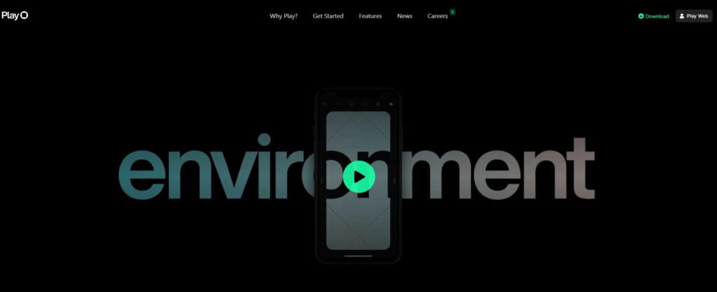
Black websites are all the rage these days, and Play is leading the pack with its new mobile app prototyping tool. The website features simple, minimal sections on the homepage, with large images and typography as the focus points. The green, mint, and purple colors are seen throughout, but they aren’t the website’s main colors – white and black are.
The same visual design style continues on their career page, with large photographs and texts as the centerpiece. The app’s visuals are consistent, with a black backdrop and green and purple highlights. All in all, the color scheme is well thought out and exceptionally executed.
If you’re looking for a website that boasts a modern design with a creative flair, then you’ll want to check out Revolt. They’ve consistently collaborated with some of the biggest names across the internet, and have mastered the art of influencer clothing. From trendy and hip images to energetic and bold web design, you’ll definitely find something to love on this site. Plus, their subtle yet cool scrolling animations are sure to impress.
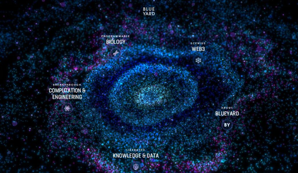
Black websites are all the rage these days, and BlueYard is leading the pack. This German investment firm has a website that is truly mind-blowing. From the very first page, you can tell that this site is something special. The futuristic design and interactive graphics are unlike anything else out there. But what really sets BlueYard apart is their superb user experience. This site is truly a joy to use, and it’s clear that a lot of thought has gone into making it as user-friendly as possible. If you’re looking for a black website that will really wow your visitors, BlueYard is the way to go.
If you’re looking for a truly unique image gallery, then you need to check out Pablo Farias’ website. The homepage features images that move endlessly according to the mouse cursor, creating a cool effect.
This website is a great example of modern web design, with its use of endless image galleries and unique scrolling animations. You can learn a lot from studying this site, so be sure to check it out!

The Cowboy website is a great example of beautiful design and engineering. The team behind it has done an amazing job of creating a sleek, 3D image of the ‘Dream Machine.’ This website is definitely worth a visit! You can learn from its smooth scrolling animations, sleek 3D images, and neutral color scheme. All of these elements come together to create a truly stunning website. Thanks, Cowboy, for setting the bar high!
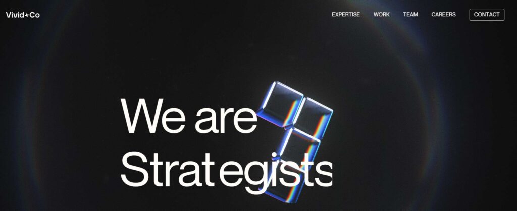
When it comes to black websites, Vivid+Co is a great example of how it’s done right. From the very first moment you land on the page, you’re greeted with wonderful examples of graphic movement and 3D animation – making it impossible to look away.
What makes this website so captivating is the use of colors and creative animations, like the Tetris-like blocks that appear as you scroll down. It’s these little details that really bring the whole design together and make it stand out from the rest.
Read More: 20+ Best Free & Paid Web Design Software Options
Final Thoughts
If you’re in need of some inspiration for your next web design project, look no further than this roundup of the most stylish black websites of 2022. From sleek and minimal designs to bold and eye-catching aesthetics, there’s something for everyone in this roundup. these are the 30 most stylish black websites of 2022. Be sure to check them out and add your own personal style to your website. So what are you waiting for? Start planning your next web design project today!
Thanks for reading!

